CBAS is a technology-driven Point of Sale (POS) and ERP platform powered by strong backend technology, built specifically for SMB shops and retail outlets. The platform enables businesses to manage sales, inventory, billing, and real-time insights through a single, unified system.
Pixelology Labs partnered with CBAS to create a modern, scalable logo identity that visually communicates speed, accuracy, and real-time data synchronisation—core to the product’s value proposition.
02 . The Challenge
The POS and ERP space is often dominated by:
- Overly technical branding that feels complex to SMB owners
- Generic software logos with little emotional or functional meaning
- Weak visual storytelling around real-time data and automation
CBAS needed a logo that would:
- Instantly convey digital intelligence and system reliability
- Appeal to small and medium businesses, not just enterprises
- Reflect real-time operations, data flow, and insights
03 . Brand Concept & Design Strategy
The CBAS logo was conceptualised around the idea of continuous digital movement and real-time data synchronisation. The wordmark uses flowing, wave-inspired forms to represent seamless data exchange across sales, inventory, and reporting systems. A key visual element within the logo is the equal-to (=) sign, which symbolises balance, accuracy, and real-time alignment—highlighting how CBAS keeps sales and inventory perfectly in sync. The overall design language is clean, modern, and technology-driven, ensuring the brand feels intelligent yet approachable for SMB retailers while remaining scalable across POS interfaces, ERP dashboards, and digital platforms.
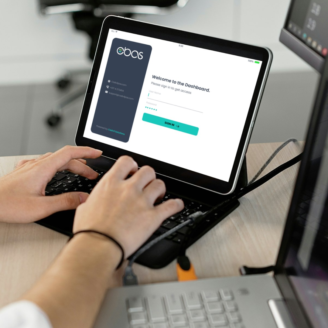
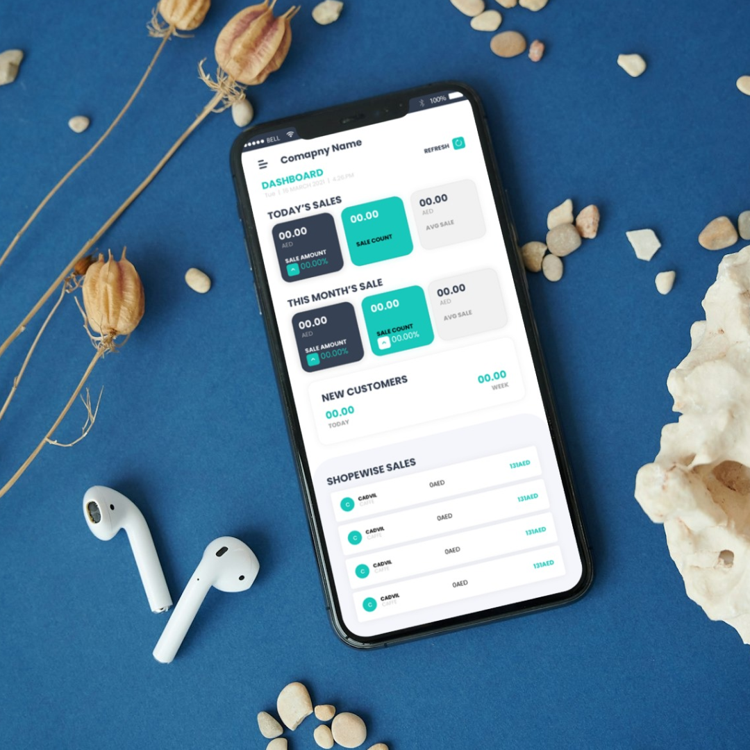
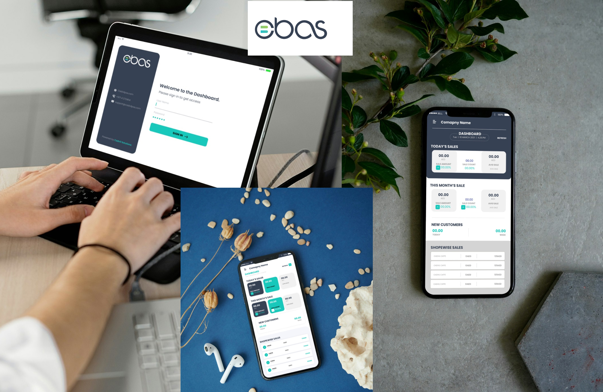
Brand Experience & Application The logo was designed to function seamlessly across:
- POS interfaces and ERP dashboards
- Mobile and desktop applications
- ales decks, onboarding materials, and digital marketing assets
The minimal yet meaningful identity ensures CBAS appears trustworthy, intelligent, and future-ready, without intimidating non-technical users.
04 . Business Impact
The refreshed CBAS brand identity improved product clarity and trust among SMB retailers, contributing to faster onboarding and stronger early-stage adoption. The simplified, insight-led visual language reduced perceived system complexity, helping sales teams explain the product more effectively and shortening the sales cycle. The logo’s emphasis on real-time synchronisation reinforced CBAS’s core value proposition, supporting higher brand recall across demos, dashboards, and marketing assets, while enabling consistent brand application across POS interfaces, ERP modules, and digital channels as the platform scaled.